

 don't be such a *doink doink*


 *Ada - Np-93/237
ada@zoner.work
Show content
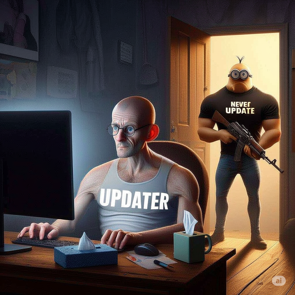
@kimapr ngl someone should make a coffee cup tissue paper dispenser for all the gooneraholics
 0
0
 0
0
 1
1


hazel cora 

h@besties.house
@ada safari has always looked so ugly on mac i have never understood it But tbf i have also never given it a fair try (I’m on Helium at the moment)
1
0
0
*Ada - Np-93/237
ada@zoner.work
@h the “mini” ui looked pretty good as long as you had less than 5 tabs open.
1
0
0


hazel cora
h@besties.house
@ada this happened in the last beta, yea (I’m not on it but I heard from others earlier)
0
0
0
*Ada - Np-93/237
ada@zoner.work
@h performance is ok, everything has frozen or crashed once so far which is about par for betas, can’t really tell if it’s running worse or better, though my lap is feeling a bit warmer but that might’ve been from the update itself rather than the OS. System utilisation is 8% which is only 1% more than previously.
On a M1 Pro.
 1
0
0
1
0
0
hazel cora
h@besties.house
@ada and are third party apps still using a different corner radius than the first party ones (due to it changing only for apps made for tahoe) cause that was the case with the last beta
1
0
0
HellPie
hellpie@raru.re@ada i swear every part of it looks like a "someone uploaded a gif to twitter and now a guy is doing the worm on the floor" but with glass and refractions
0
0
0
*Ada - Np-93/237
ada@zoner.work
@h so far only electron and ironically Mac Catalyst (i.e. iPadOS/iOS apps) are using the old corner radius.
1
0
0
*Ada - Np-93/237
ada@zoner.work
0
0
0
*Ada - Np-93/237
ada@zoner.work
@h yeah pretty much every app still uses the old radius
except rio for some reason
also the settings app is borked as hell what is this ui

 2
0
0
2
0
0
hazel cora
h@besties.house
@hellpie @ada im fine with trying buggy betas, ive been on the ios 26 beta since it came out and obviously there’s bugs but like, whatever if you have a backup. like i know what im getting into and itd be the same with the macos one i just also wanna know whether i would even care to spend that time lol
0
0
0
hazel cora
h@besties.house
@ada i was hoping theyd backpedal on rounding the corners so much more 💔
Also yeah not a fan of the floating side menus in all the apps now, just looks weird, they could at least put more work in to make it actually fit with the app though instead of just shoving it on like this lol
1
0
0
*Ada - Np-93/237
ada@zoner.work
@h safari does not work at all with it 😭
but i think most of that is bugs, i don’t think every tab having a dark line at the bottom is intended.
margins seem off all over the place as well
0
0
0
Autumn (Literally a Fops)
null@0xportal.social
1
1
0
coral castle
welcome to coral castle, a chill community sailing on the fediverse. we strive to be a safe, left-leaning, queer-friendly, communitarian space for all kinds of folk. before joining, make sure to read our community guidelines.
community guidelines
- you must be over 14 years old to join. coral castle's servers are hosted in chile, and under article 19,628 of the laws of chile, we are unauthorized to collect data from people under 14.
- do not spam or raid. the fediverse is not your space to intoxicate.
- nsfw/nsfl content must be marked as sensitive. coral castle is built to be used as a casual instance, and as such should be accessible anywhere.
- hate speech, paraphilia, and harassment will get you banned. having basic human decency is key anywhere. whether it is in real life or on the internet, don't be a jerk.
- keep things legal. this includes pirated content, since we want to keep a good relationship across fediverse servers. posting CSAM is strictly forbidden and will result in legal action.
moderation policies
the sanctions for local users will be relative to the gravity of their infringements, varying from simply deleting the offending material, to warning the user through a three-strike system, to immediately banning the offending user.
if you're an instance administrator and you think your instance was sanctioned by mistake, feel free to appeal by emailing me at lux@nixgoat.me
special thanks
to our donators, for helping keep this instance up:
also, to the following organizations: